
Damon Crockett
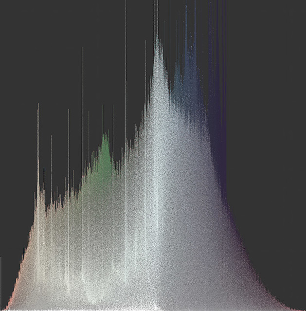
Fig 1. One million slices of a satellite image from downtown San Diego, arranged as a hue histogram sorted vertically by saturation.
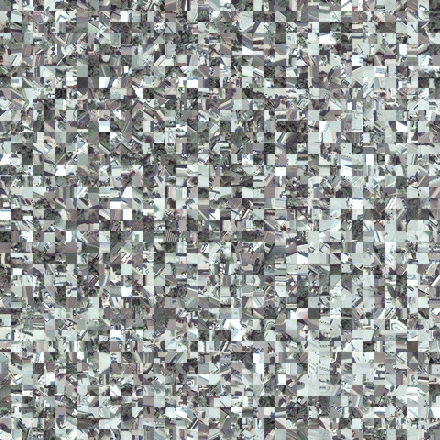
Fig 2. Closeup of slice histogram above.
INTRODUCTION
Perhaps primary amongst the outputs of our lab are visualizations of Big Image Data, and in particular what we call 'media visualizations' - visualizations of image data whose primary plot elements are the images themselves. Media visualizations are special cases of glyph visualizations, a class of statistical plots that present data points as glyphs - icons that carry information by way of their non-relational characteristics, things like size, shape, color, etc.
Glyph visualizations are not at all uncommon. For example, the popular plotting library ggplot in the R language can make glyphs of its scatter points (Figure 3), allowing the user to encode additional features in the visualization.
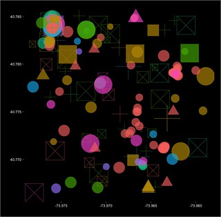
Fig 3. Glyph scatterplot. Five data dimensions are presented on two axes.
Because traditional scatter points have no non-relational characteristics - they are in fact point locations and not objects at all - they carry information only by their spatial positions. Traditional scatterplots, then, can present only as many informational dimensions as there are plotting axes. If, however, each scatter point is made a glyph with n non-relational characteristics, the dimensionality of the visualization is increased by n.
Media visualizations can therefore be understood as limit cases of glyph visualization, because they preserve, strictly speaking, all of the visual information in the dataset, and for image data, preserving all the visual information is preserving all the information. Of course, in practice, this isn't exactly true, since non-visual information (like time and place) will very often figure in the analysis, but typically, this data is used to define a subset of the data we're interested in, e.g., 'all the Instagram photos from Manhattan during this year's Fashion Week', and then our visualization of that subset now focuses exclusively on the visual information.
In any case, even assuming we care only about visual information, the mere presence of the information in the visualization does not guarantee its being readable for the viewing subject. Important for media visualizations are particular choices about sorting or otherwise organizing the images on the canvas in order to reveal patterns. Our lab has pioneered a suite of techniques for organizing images as plot elements on large digital canvases. These techniques are on display in several of our projects (most notably, Phototrails). We use sorted rectangular montages, Cartesian scatterplots, and perhaps most identifiably, polar scatterplots.
IMAGE HISTOGRAM
Recently, we've pioneered a new technique, one that has roots in our Selfie City project (thanks to Moritz Stefaner): the Image Histogram. The most basic form of the Image Histogram simply gives the distribution of a single feature, visual or non-visual, and uses the images themselves as plot elements. Like the Image Montage, the Image Histogram gives every image its own place in the plot, and like the Image Plot (scatterplot), the Image Histogram uses an axis to organize data points. We have found this combination of characteristics to be very useful in presenting, e.g., temporal patterns in image data.
But because Image Histograms are media visualizations, we needn't settle for the presentation of a single feature. The images themselves are right there on display, and although the particular choice of histogram (i.e., what gets assigned to the x-axis) dictates the horizontal sorting, the vertical sorting is still up for grabs and can reveal additional patterns in the data. We can therefore think of each histogram bin as a columnar montage that can be sorted as many times as we like. In Figure 4, we can see the results of multiple vertical sorts.
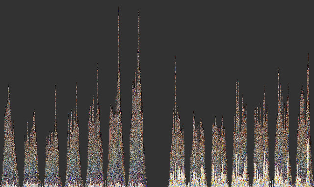
Fig 4. Image Histograms binned by hours over a week, sorted vertically by both brightness and hue.
The Image Histogram is a powerful statistical tool that admits of a great deal of variation, and is implemented using open source Python code (we use the Python Imaging Library). Big thanks to Cherie Huang for the original code. All of the Image Histograms shown here were made with a fork from that original code, using Python's pandas library and its lightning-fast operations over data tables.
SLICE HISTOGRAM
My own work with the lab began around the time we started making Image Histograms, and I confronted a problem: I wanted to make media visualizations that reveal, with great clarity, the color properties of image datasets. Images wear their colors on their sleeves, of course, and so media visualizations do carry color information - all of it, in fact - but again, particular choices about sorting can matter a lot.
Unfortunately, even our very best sorting choices for Image Histograms do not yield crystal clear presentations of color. And the problem is that images typically contain lots of different colors. When you sort them by color, how do you do it? Do you take the mean hue of the whole image? The mode? Do you look at all color dimensions, or just one? How you answer these questions will depend on your goals, of course, but the questions are less important if the images have very low standard deviation of their color properties. The more uniformly-colored the images, the easier it is to sort them by color. But we can't simply enforce uniformity in our data. What we can do is plot slices of images instead of whole images. This general idea is at work in various computer vision algorithms, and it makes good sense: images typically capture scenes, and scenes have parts, so we should at the very least be looking at those parts, whatever else we do. In computer vision (and human vision), the selection of parts can be very sophisticated (in human vision, this is roughly the function of visual attention), but it is computationally expensive. We need a way to get better color visibility without sacrificing computational speed.
I developed a technique that is fast and yields excellent color visibility (Figure 5; closeup in Figure 6). Each image is sliced into some number of equal-sized parts, features are extracted from the parts, and those parts are then plotted as an Image Histogram. The entire process, carried out with 1 million slices, can take less than an hour.
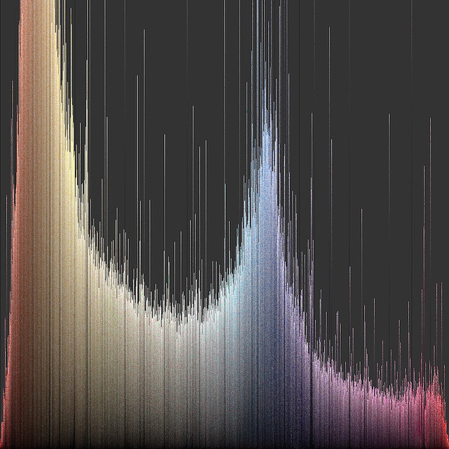
Fig 5. Hue histogram sorted vertically by brightness.
Fig 6. Closeup of slice histogram above.
The number of parts will depend on the kind of images we use. In my own work, I set a criterion value for average standard deviation of hue (~0.1) and then find the minimum number of parts needed to meet the criterion. This approach ensures both that the plots will make a smooth (and consistent) presentation of color and that they will carry as much object content as is possible for that particular source of image data at that particular criterion value (this as opposed to slicing all types of image data into the same number of parts). As you might imagine, the more 'zoomed out' the original image data, the clearer the object content at any particular criterion value. Satellite photos give excellent results, for example (see Figures 1 and 2 at the top of the page).
The object content is an important product of this technique. Because the plot is, like all media visualizations, composed of the images themselves, it still carries much of the information it would have carried had we used whole images - that is, unless we set the criterion value so low that our slices are uniform fields of color (even single pixels!). This would yield maximal color visibility, of course, but we'd lose all the other information. Choosing a criterion value, then, is choosing the balance between color visibility and object information. As we lower the criterion value, we look at progressively smaller parts of scenes, and gradually, they lose their structure. Just where we choose to stop this degradation will depend on our analytical goals.
It is important to note that both the Image Histogram and the slicing technique are very general use tools, and admit of great variation in their application. And of course, the tools have no particular analytical power without some intelligent selection of data. For example, we might want to compare the color signatures of different sources of image data for the same region (Figure 7).
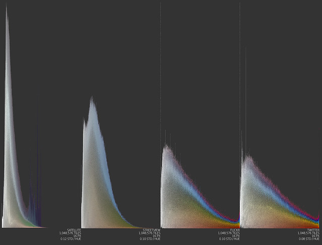
Fig 7. Slice histograms for four different sources of image data: satellite, Google Streetview, Flickr, and Twitter.
Or, we might want to visualize the colors of a particular concept, like 'autumn' (Figure 8).
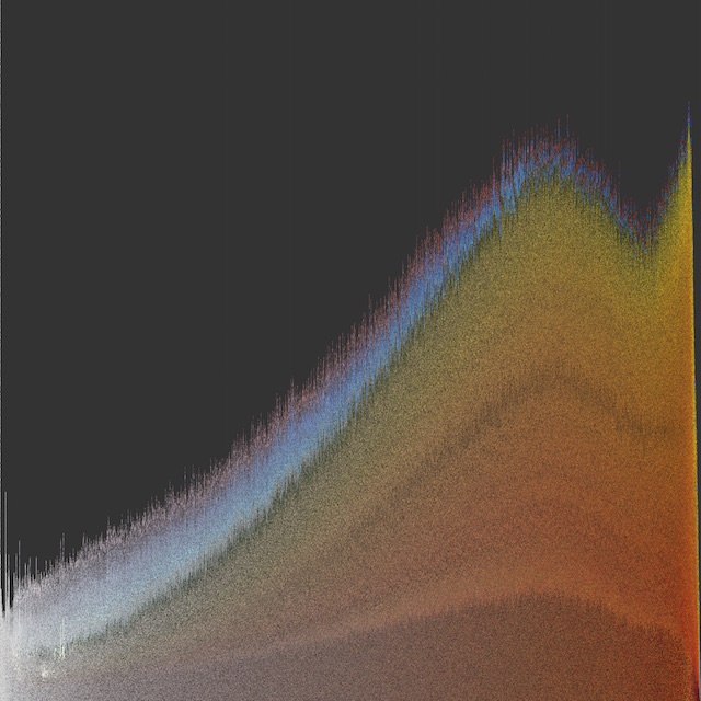
Fig 8. Slice histogram of Flickr images autotagged 'autumn' from New England.
Additionally, in making slice visualizations, it's not essential that the visualization take the form of a histogram. What is essential is that the plot elements have low standard deviation of whichever visual properties we're interested in, and that there be some method of sorting that groups together similar elements. That's it. We can transform these histograms into any sort of plot, or montage, or map we like. In an upcoming post, I'll talk more about my efforts to expand the space of possible forms of media visualizations can take.
Fig 1. One million slices of a satellite image from downtown San Diego, arranged as a hue histogram sorted vertically by saturation.
Fig 2. Closeup of slice histogram above.
INTRODUCTION
Perhaps primary amongst the outputs of our lab are visualizations of Big Image Data, and in particular what we call 'media visualizations' - visualizations of image data whose primary plot elements are the images themselves. Media visualizations are special cases of glyph visualizations, a class of statistical plots that present data points as glyphs - icons that carry information by way of their non-relational characteristics, things like size, shape, color, etc.
Glyph visualizations are not at all uncommon. For example, the popular plotting library ggplot in the R language can make glyphs of its scatter points (Figure 3), allowing the user to encode additional features in the visualization.
Fig 3. Glyph scatterplot. Five data dimensions are presented on two axes.
Because traditional scatter points have no non-relational characteristics - they are in fact point locations and not objects at all - they carry information only by their spatial positions. Traditional scatterplots, then, can present only as many informational dimensions as there are plotting axes. If, however, each scatter point is made a glyph with n non-relational characteristics, the dimensionality of the visualization is increased by n.
Media visualizations can therefore be understood as limit cases of glyph visualization, because they preserve, strictly speaking, all of the visual information in the dataset, and for image data, preserving all the visual information is preserving all the information. Of course, in practice, this isn't exactly true, since non-visual information (like time and place) will very often figure in the analysis, but typically, this data is used to define a subset of the data we're interested in, e.g., 'all the Instagram photos from Manhattan during this year's Fashion Week', and then our visualization of that subset now focuses exclusively on the visual information.
In any case, even assuming we care only about visual information, the mere presence of the information in the visualization does not guarantee its being readable for the viewing subject. Important for media visualizations are particular choices about sorting or otherwise organizing the images on the canvas in order to reveal patterns. Our lab has pioneered a suite of techniques for organizing images as plot elements on large digital canvases. These techniques are on display in several of our projects (most notably, Phototrails). We use sorted rectangular montages, Cartesian scatterplots, and perhaps most identifiably, polar scatterplots.
IMAGE HISTOGRAM
Recently, we've pioneered a new technique, one that has roots in our Selfie City project (thanks to Moritz Stefaner): the Image Histogram. The most basic form of the Image Histogram simply gives the distribution of a single feature, visual or non-visual, and uses the images themselves as plot elements. Like the Image Montage, the Image Histogram gives every image its own place in the plot, and like the Image Plot (scatterplot), the Image Histogram uses an axis to organize data points. We have found this combination of characteristics to be very useful in presenting, e.g., temporal patterns in image data.
But because Image Histograms are media visualizations, we needn't settle for the presentation of a single feature. The images themselves are right there on display, and although the particular choice of histogram (i.e., what gets assigned to the x-axis) dictates the horizontal sorting, the vertical sorting is still up for grabs and can reveal additional patterns in the data. We can therefore think of each histogram bin as a columnar montage that can be sorted as many times as we like. In Figure 4, we can see the results of multiple vertical sorts.
Fig 4. Image Histograms binned by hours over a week, sorted vertically by both brightness and hue.
The Image Histogram is a powerful statistical tool that admits of a great deal of variation, and is implemented using open source Python code (we use the Python Imaging Library). Big thanks to Cherie Huang for the original code. All of the Image Histograms shown here were made with a fork from that original code, using Python's pandas library and its lightning-fast operations over data tables.
SLICE HISTOGRAM
My own work with the lab began around the time we started making Image Histograms, and I confronted a problem: I wanted to make media visualizations that reveal, with great clarity, the color properties of image datasets. Images wear their colors on their sleeves, of course, and so media visualizations do carry color information - all of it, in fact - but again, particular choices about sorting can matter a lot.
Unfortunately, even our very best sorting choices for Image Histograms do not yield crystal clear presentations of color. And the problem is that images typically contain lots of different colors. When you sort them by color, how do you do it? Do you take the mean hue of the whole image? The mode? Do you look at all color dimensions, or just one? How you answer these questions will depend on your goals, of course, but the questions are less important if the images have very low standard deviation of their color properties. The more uniformly-colored the images, the easier it is to sort them by color. But we can't simply enforce uniformity in our data. What we can do is plot slices of images instead of whole images. This general idea is at work in various computer vision algorithms, and it makes good sense: images typically capture scenes, and scenes have parts, so we should at the very least be looking at those parts, whatever else we do. In computer vision (and human vision), the selection of parts can be very sophisticated (in human vision, this is roughly the function of visual attention), but it is computationally expensive. We need a way to get better color visibility without sacrificing computational speed.
I developed a technique that is fast and yields excellent color visibility (Figure 5; closeup in Figure 6). Each image is sliced into some number of equal-sized parts, features are extracted from the parts, and those parts are then plotted as an Image Histogram. The entire process, carried out with 1 million slices, can take less than an hour.
Fig 5. Hue histogram sorted vertically by brightness.
Fig 6. Closeup of slice histogram above.
The number of parts will depend on the kind of images we use. In my own work, I set a criterion value for average standard deviation of hue (~0.1) and then find the minimum number of parts needed to meet the criterion. This approach ensures both that the plots will make a smooth (and consistent) presentation of color and that they will carry as much object content as is possible for that particular source of image data at that particular criterion value (this as opposed to slicing all types of image data into the same number of parts). As you might imagine, the more 'zoomed out' the original image data, the clearer the object content at any particular criterion value. Satellite photos give excellent results, for example (see Figures 1 and 2 at the top of the page).
The object content is an important product of this technique. Because the plot is, like all media visualizations, composed of the images themselves, it still carries much of the information it would have carried had we used whole images - that is, unless we set the criterion value so low that our slices are uniform fields of color (even single pixels!). This would yield maximal color visibility, of course, but we'd lose all the other information. Choosing a criterion value, then, is choosing the balance between color visibility and object information. As we lower the criterion value, we look at progressively smaller parts of scenes, and gradually, they lose their structure. Just where we choose to stop this degradation will depend on our analytical goals.
It is important to note that both the Image Histogram and the slicing technique are very general use tools, and admit of great variation in their application. And of course, the tools have no particular analytical power without some intelligent selection of data. For example, we might want to compare the color signatures of different sources of image data for the same region (Figure 7).
Fig 7. Slice histograms for four different sources of image data: satellite, Google Streetview, Flickr, and Twitter.
Or, we might want to visualize the colors of a particular concept, like 'autumn' (Figure 8).
Fig 8. Slice histogram of Flickr images autotagged 'autumn' from New England.
Additionally, in making slice visualizations, it's not essential that the visualization take the form of a histogram. What is essential is that the plot elements have low standard deviation of whichever visual properties we're interested in, and that there be some method of sorting that groups together similar elements. That's it. We can transform these histograms into any sort of plot, or montage, or map we like. In an upcoming post, I'll talk more about my efforts to expand the space of possible forms of media visualizations can take.